The Bros
Redesigning a restaurant menu around how people actually choose food.
- Role
- UX research & UX/UI design
- Project type
- UX/UI course project
- Scope
- Mobile-first menu · English & Arabic
Act I
Understanding how people choose
Why a PDF menu fails someone who is hungry and holding a phone.
01The challenge
A restaurant’s menu is its most important page online, and it’s usually a PDF.
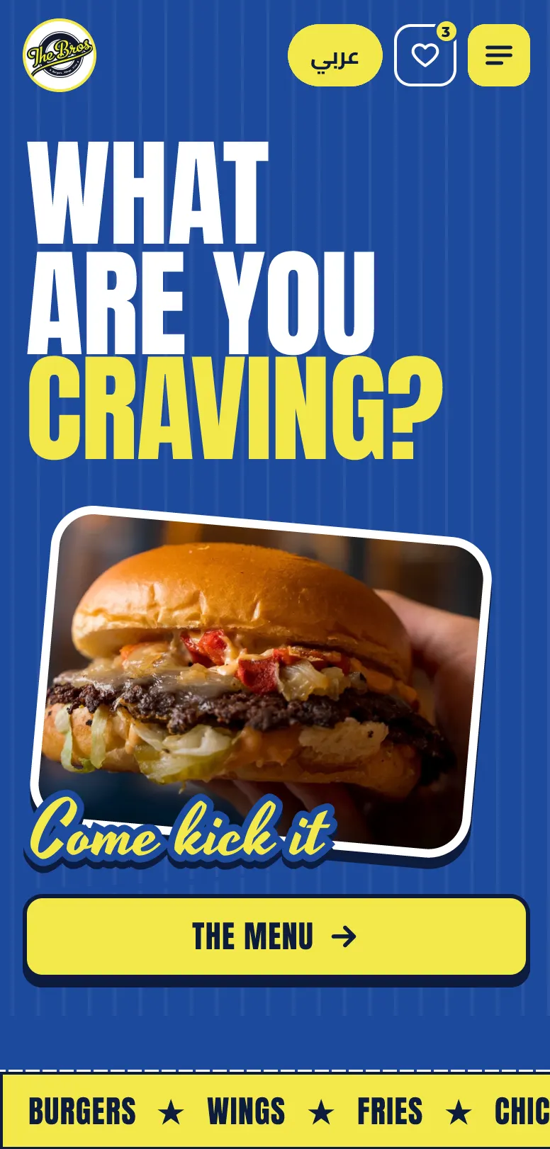
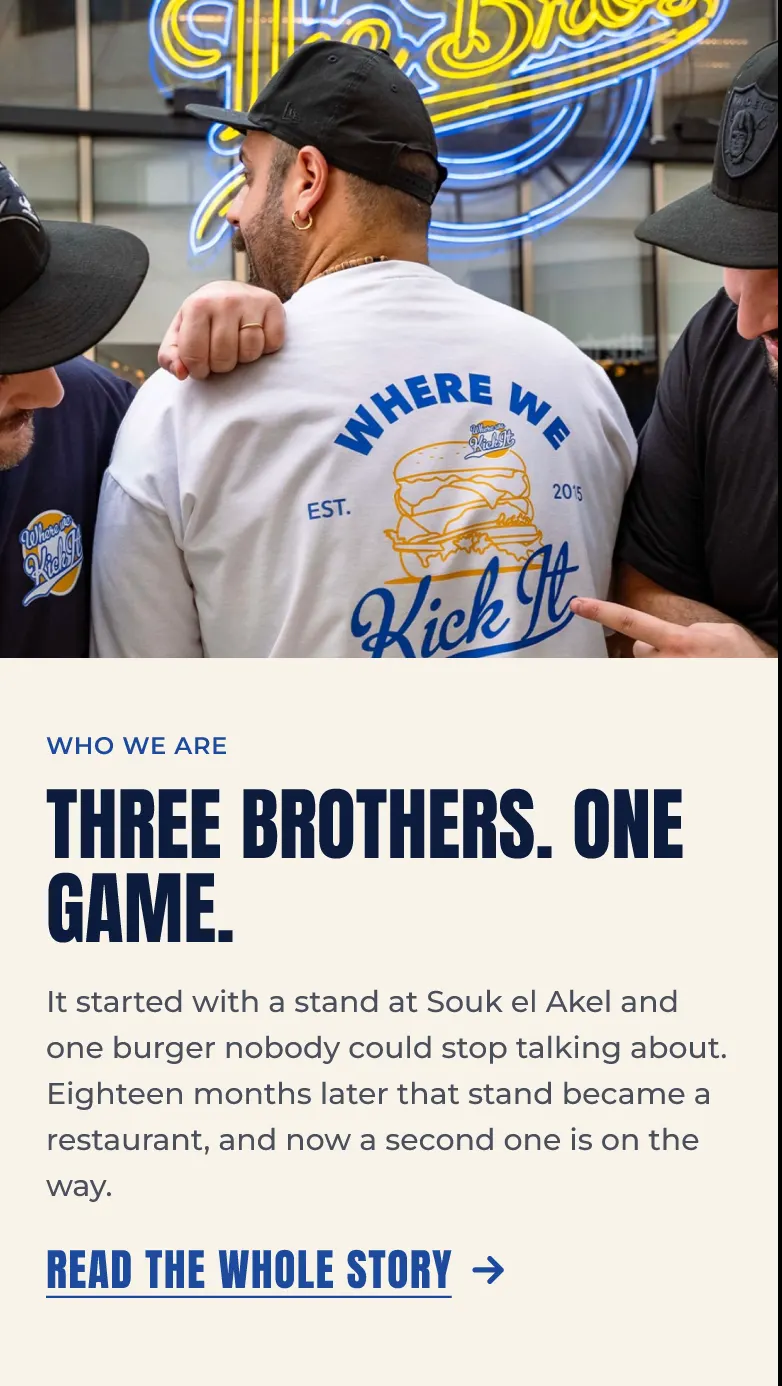
The Bros is a Beirut burger spot with a loud, playful personality. I redesigned its menu as a mobile-first website in English and Arabic, so a hungry person can decide fast without losing that personality.
this looked much better in my head.
 Before
Where the menu lives today.
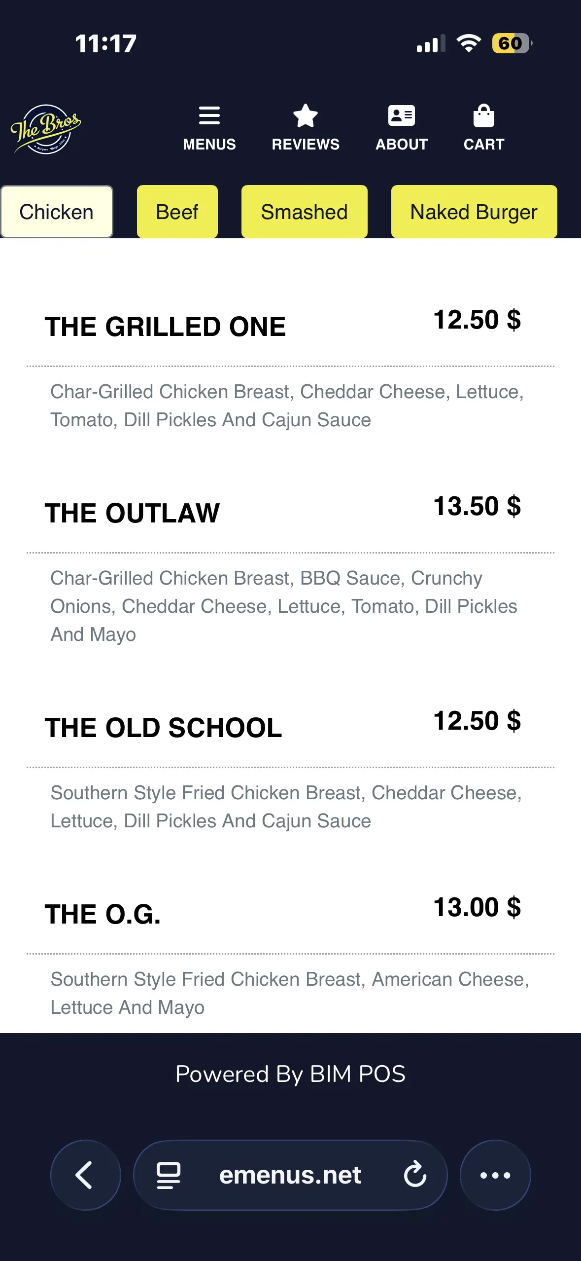
The Bros’ menu currently sits on a third-party e-menu platform: a text-only list with no food photos, built on the same template other restaurants use. The redesign starts from what that page can’t do: carry the brand, and help a hungry person decide fast.
Act II
Designing the menu
Keeping a loud brand while making every decision faster.
02Why it looks like this
Loud, but organized.
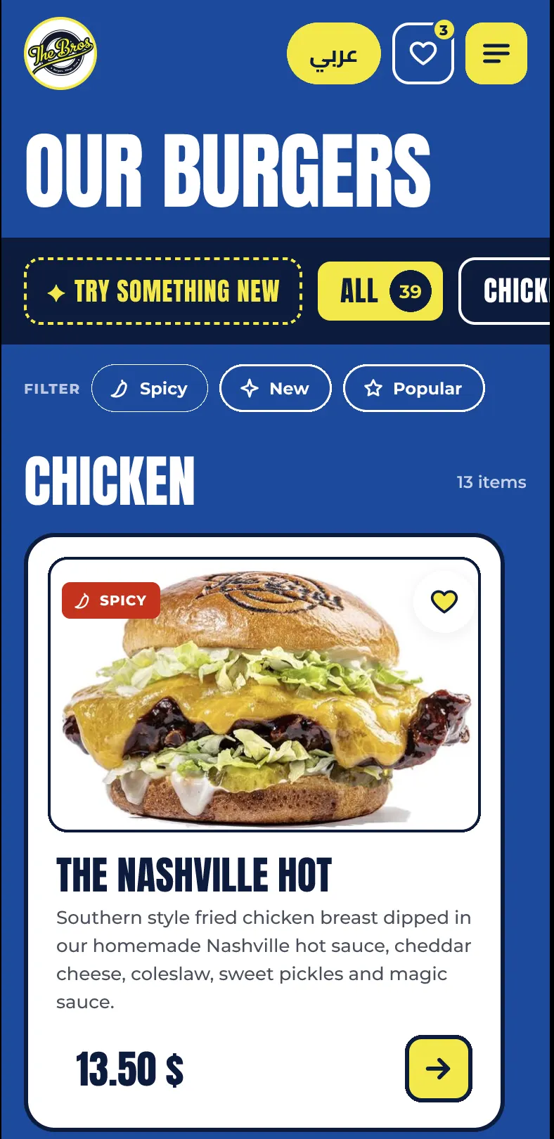
People scan menus, they don’t read them. So the photo leads, prices always sit in the same place, and filters (spicy, new, popular) do the scrolling for you. The colors come straight from the brand: Bros blue for energy, yellow for appetite, white to let the food breathe.
- Bros blue swatch
Bros blue
- Yellow swatch
Yellow
- White swatch
White
- Ink swatch
Ink
Act III
Putting it in people’s hands
The full prototype, ready to click through.
03Try it